Mind the Map at British Transport Museum
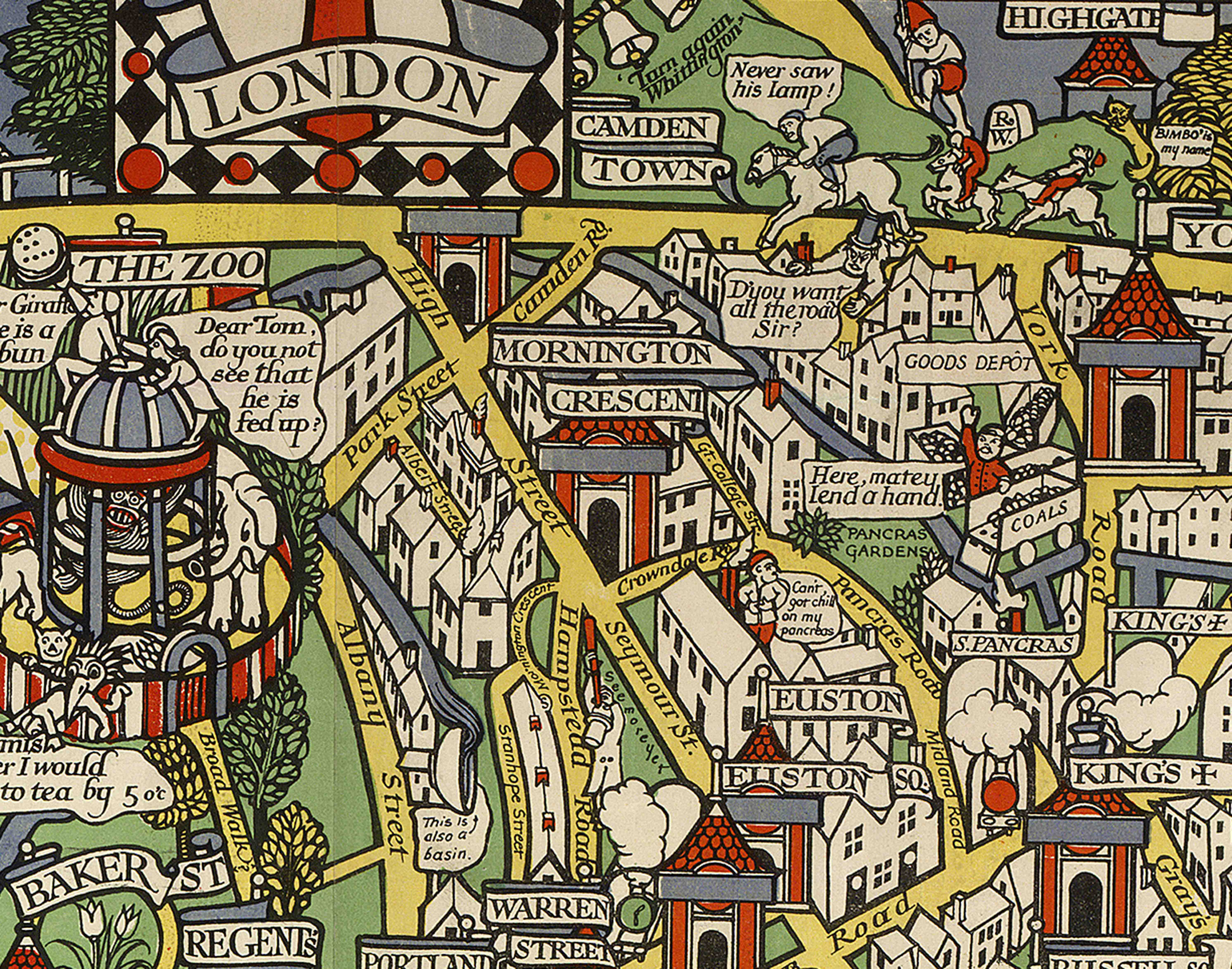
If anyone knows roads in London, it’s Transport for London. It makes sense, in that case, that their very own London Transport Museum played host to new exhibition Mind the Map. The cartographic exhibition not only laid out years of the capital in print form, it also celebrated the artists who have, over the years, contributed to the maps which have become almost commodity.
The way London is mapped from a personal or an artistic point of view does give insight into how we view the world around us. Tracy Emin recently contributed a drawing of her own tube map to be distributed during the 2012 Olympics. Her map would have fit perfectly into the Mind the Map exhibition alongside work from MacDonald Gill, Stephen Walter, and Simon Patterson. Each of the three uses a method to design their maps which are unrelated to each other to convey their own physical image of the capital.
The late MacDonald Gill favoured cartography which was always incorporated some level of satire or a political edge. Though his work was never solely London-centric, Gill did produce some pieces which depict London through his own cynical eye. As a typical depiction from his era one of the maps shows the “workforce” holding up the more affluent areas of London.
Simon Patterson’s Great Bear, on the other hand, takes something that is as recognisable as the sky and turns it into something with aplomb and identity. Patterson uses the skeleton of the tube map we see everywhere (of Harry Beck’s design) but changes the names of the station to lines filled with scientists, saints, philosophers, and explorers among other groups. I wonder what it would be like to get of the tube at Marco Polo, or at Nietzsche. There were only fifty copies ever made and there will be one on display at Mind the Map for the duration of the exhibition. There’s an updated version nearby which includes a pink Murdoch line with station names after shamed journalists.
The work of Stephen Walter again brings something of a social edge with incorporation of stereotype and humour. His hand drawn map of London Waterways, completed in his signature style, is painstakingly correct in terms of geography yet a closer look reveals further details which could never be transcribed from something previous. The tremendous details of Walter’s cartography work is what puts it in another dimension in comparison to the stark work created by Patterson yet it also bears few similarities to anything by Gill.
The whole exhibition pulls together in one cohesive work to present London on a personal scale. From the very earliest attempts to put London in perspective to the more recent attempts to throw the geography of the city in disarray there’s a whole range of cartographic revelry on display.
I imagine Olympics 2012 visitors riding a Boris bike to the tune of our tube map. Oh the fun.
Natalie Ashett













Facebook
Twitter
Instagram
YouTube
RSS