Olympic architects talk with Crane TV at Soho House

As the world focuses its attention on our city for the 2012 Olympics, Crane TV sat down with four of the architects responsible for the breath-taking, almost otherworldly buildings that have popped up in the once underdeveloped areas of East London and discussed their ideas, their inspirations and the challenges they faced in bringing the Olympic city to life.
Accomplished architect Rod Sheard is the only person to have designed two Olympic stadia, masterminding the ANZ Stadium for the 2000 games in Australia, as well as the Olympic stadium that now forms the focus of our attention for London 2012. “It took Ken Livingstone, who is no great sports fan, to see that regeneration was what that part of East London needed,” he explained. Rod’s stadium is a complex, flexible “series of components, that could go together in one particular way for the Olympic games, but can be put back and reassembled in a different way for whatever happened afterwards.”
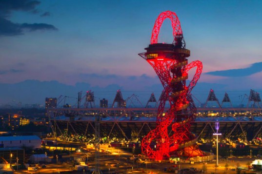
Kathryn Findlay designed The Orbit Tower in collaboration with artist Anish Kapoor. She describes the process as “a balance between poetic requirements and pragmatic needs…we had to create a darkness at the bottom, and make it ethereal at the top. It’s designed to be a viewing platform, a visual centrepiece”. She also said one of the greatest pleasures was proving the critics wrong: “people who said, ‘you’re-working on that thing?’” can now see how beautiful and unusual the final result is.
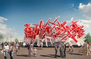
The architects behind the Pavillion – Pernilla Ohrstedt and Asif Khan – were handpicked by Coca-Cola for their innovative, interdisciplinary and interactive designs. Their Coca-Cola Beat Box enables people to “play” with the building through sounds embedded in the architecture. The building is a jagged collection of red and white lines and works almost like a musical instrument, combining the work of musician and producer Mark Ronson to create something direct and hard-hitting. As Asif explained: “Music, amongst the many art forms we take inspiration from, is the one we filter less. It’s a more high-risk strategy.”
The designers also took a chance with their decision not to use the Coca-Cola logo on the outside of the building – a first for the globalised mega-company whose usual tactic is to broadcast their brand to the furthest reaches possible. “We convinced them we could do it with just colour,” smiles Asif, and looking at the building, with its immediately familiar shade of cherry-red and white, it’s clear that he was right.
It is this type of innovation and freshness that unites all four designers here tonight. What they share is a drive towards the future, a faith in the possibilities of innovation in architecture and the wider world of design. As Kathryn explained: “The precedent set is that architecture has a broader means of expression. Buildings aren’t just a monument, they are for people; they can be reused. It’s not just about material. There were wild flowers cultivated in the Olympic park, for example. It’s a legitimisation of different architectural forms.”
When asked what the four designers thought of the controversial London 2012 logo, laughter rippled about the room. Rod remained emphatic, stating: “I thought it was great. It had a lot of legs” and added, “I might be mistaken but I think it’s the only Olympic logo that has been kept from beginning to end. We used it in everything, from the seating plan to the design of the stadium.” Asif expressed some disappointment in the choice, recalling how many “smaller, lesser known studios came up with brilliant ideas” but Olympic organisers ultimately went with a more established design house. “I think the colour scheme is much more powerful,” added Pernilla diplomatically. “Suddenly this whole city has turned pink, it’s lovely. But the logo, it’s not that memorable.”
Asif also jokingly compared having Olympic spectators in the Pavilion to “re-decorating your house, then having your first house party. I went in today and saw our aluminium stools have got scratches all over them. You think – ‘whose done this?’ But really it’s fine because it’s for them, they undo it. The journey has begun when we hand it over.”
Rod had a similar view, observing that “the analogy is a little bit like children: you let them go out into the world and make their own mistakes but you never truly let them go. But with a stadium I think that it’s slightly different. We do our buildings not for the end result but for what’s going to happen in them. We very much see these buildings as three-dimensional blank canvases.”
This twinning of promise and possibility – of constructing something magical out of nothingness – is behind everything these visionary artists do. The London 2012 Olympics have benefitted enormously from their boundless creativity and artistic energy. However, these aren’t just buildings that are meant for two weeks. Once the Games have been and gone, these structures – along with the artistry, inventiveness and dynamism that created them – will slot into London’s already fascinating urban landscape, and hopefully continue to benefit our city for years to come.
Maia Jenkins
Video interviews with all four designers can be found here:


Facebook
Twitter
Instagram
YouTube
RSS