Young V&A
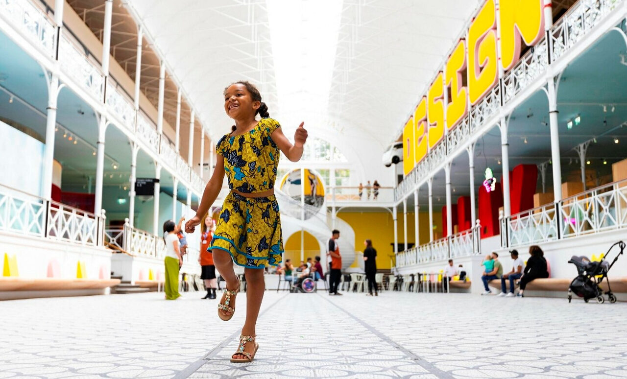
It was at the “finger skate park”, a miniature recreation of the skate park in nearby Victoria Park where finger-sized skateboards can be scooted around dinky topography, that the realisation dawned there was a kind of genius at work here. It was like the best play: a seriously realised account of something just a little bit surreal. At the same moment, Curator of the Design Gallery Kristian Volsing presided over this creation with a joyful glint of eye indicative of the rarely encountered super-creative. He, Chief Curator Alex Newson and the whole Curatorial team of Will Newton, Sophie Sage, Trish Roberts, Tanaya Basu De Sarkar and Holly Tatham, along with architects De Matos Ryan, have transformed the museum.
The Young V&A’s previous incarnation as the eerie Museum of Childhood was about childhood, not for it. This £13 million revamp (funded by donations) was created with the input of some 22,000 children and their families – and it shows. They didn’t get to build the requested slide for myriad logistical reasons, but they implemented many of the suggestions, especially for more colour, pattern and light. Previously covered windows and skylights have been allowed to flood the space with light once again, the original wrought ironwork has been painted white, a spiral staircase inspired by a kaleidoscope installed and colour is everywhere. Everything has been refreshed and brightened while retaining the original Victorian features, like the mosaic floor of the atrium, which is now an airy café space.
At the forefront of the renewal was the idea that children have as much right to enjoy the vast (2.8 million objects) collection the V&A owns as adults do. The museum has been designed to capture young minds to not see museums as boring, restrictive or intimidating.
The permanent displays are divided into three sections: Play for under-fives; Imagine for five to 11-year-olds; and Design for 11 to 14-year-olds. The Play area is sensory, the focus on colour, touch and sound. Display cases are at the right level for toddlers and mirror the texture of the objects inside so that the children can feel like they are touching the object in the case. In Imagine, children are invited through prompts to make up their own stories. There is a small theatre nestled ingeniously in the middle of the space covered in lush red velvet, with a dressing-up room and a Frankenstein that crackles with thunder and lightning when you step near it.
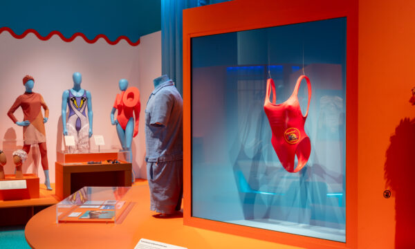
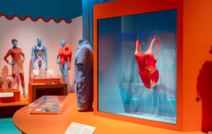
Design features design classics and many examples of what can be done with innovation, like the “Hero Arm” prosthetic that takes its design cues from Marvel, is operated by residual nerve impulses and, crucially, arrives in packaging that can be opened single-handedly. The contributing children’s biggest concern was climate change, so there is an emphasis on sustainability and innovative materials. In this way, it is lightly revolutionary, with a banner wafting the words “Change is coming”.
You get the sense of curators having a ball here. Objects are collected in new and unexpected ways, grouped by colour or alphabetically for example, rather than in more traditional categorisation. Fun factlets about the process emerge: a Jabba the Hut figurine exuded such a toxic slime that he was a threat to his display case mates, so one member of the conservation team was tasked with concocting a more friendly type of slime. While the technical services team had the dilemma of how to display a Buckaroo toy in mid-buck.
Everywhere are details that make you laugh with joy. “The Street” places doll’s houses in a little community, the carpet a map of the museum’s local area, and the Teenage Ninja Mutant Turtles in the sewers, naturally. A large Art Deco doll’s house, commissioned as a miniature of a real house, complete with pool, murals on its interior walls and a party going on inside. is an absolute delight. There is a feeling of worlds within worlds and an emphasis on creating. In the arcade section, there is a Minecraft game of the museum that has been created especially and a station where children can create their own board games. Elsewhere, there is a self-portrait station where you take a selfie which is then displayed so you can trace over it.
There is an Ames room which plays, Alice in Wonderland style, with perspective; a surrealist room; serious art amongst the toys such as a Hokusai and a Hockney; Joey the War Horse; Mary Poppin’s umbrella to name but a few more attractions. Everything has been meticulously thought through and it pays off.
It may sound ungrateful as who could want for anything more but a thought occurred: in the future would the V&A consider putting its considerable talents and collection into creating a space like this for neurodivergent and traumatised adults? Where objects are presented in unexpected ways to fire new neural connections? Just a thought…
This is a next-generation museum, a glorious gallery that makes you laugh with joy, with a wealth of resources all for free. Frankly, any parent would be mad not to take their kid here.
Jessica Wall
Image: David Parry
Young V&A opens on 1st July 2023. For further information visit the exhibition’s website here.








Facebook
Twitter
Instagram
YouTube
RSS