The psychology of store layouts
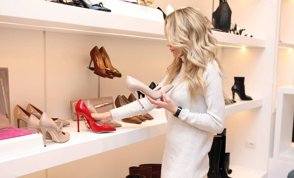
The layout of a store has massive potential to influence shopping habits, making shopping trips of customers easier and guiding them to products they might not have otherwise considered. If you’re a store owner, these strategies can lead customers to your best and most profitable products, increasing your revenue and customer loyalty simultaneously.
Hints and Teases
People are often enticed by hints and teases about what they can find in your store; this is why window displays are such a powerful means of attracting foot traffic. Give passersby and initial customers a strong suggestion of what they can find in-store, but don’t show them everything. If they want to know more or see more, they can come in and shop around.
Open Entrances
You can also make a good first impression by creating a wide, open entrance. This has a variety of positive effects.
If your entranceway is overly cluttered, full of different products and displays, your customers may feel overwhelmed; they’ll have a hard time settling on any single area, and may feel intimidated or uncomfortable, even if it’s only slightly.
If your entranceway is open, it allows customers to focus their attention on the things you want them to see the most; this is especially useful if you have an important display you want to make prominent. As an added bonus, you can make multiple aisles visible at once, helping customers figure out where they want to go.
Intuitive Organisation
It’s also important to think about the organisation of your store. Customers should be able to find what they need as quickly as possible. Modelling your shop layout after conventional shop layouts can help here, but you’ll also want to employ a system of clear labelling—and use technology to help when you can. For example, food and beverage brands often use apps that allow customers to find their products in store easier.
Personal Space
When shopping, customers want ample personal space. If your aisles are too tight or crowded, they’ll brush up against other patrons and have difficulty moving around stationary customers. Even if it means sacrificing some display room, more space is better.
Building to the Right
Most people naturally turn to the right when entering a building, and for Americans, this effect is even more prominent. You can cater to this natural preference by building your “main” path to the right of the main entranceway. To the right, you can place the sections or displays you want your customers to interact with most. You can also use this as the beginning of your storewide “loop.”
Vertical Shelving Priorities
Most physical stores organise the products on their shelves vertically, based on not only the type of products they’re selling, but also their target customers. Generally speaking, the most profitable products or the most desirable products are placed at eye-level, making them easier for people to see, with less desirable products at the top and bottom of the shelves.
However, eye level varies per target audience, and needs to be taken into consideration. For example, brightly coloured breakfast cereals, which cater to children, are often put at the eye level of children riding in shopping carts, slightly lower than an average adult’s eye level.
Endcap Attention
The endcaps of aisles tend to attract attention naturally. Customers looking for a specific aisle will naturally be distracted by these displays, and they tend to stand out in your attention as you walk through the store. Additionally, these endcaps stand out because they have massive space between them; there aren’t many products or displays to compete with them. Accordingly, most stores try to put their best products in one or more endcap displays.
Convenient Navigation
It should be an obvious assessment that people like store layouts that are convenient. The easier it is to get around and find what you’re looking for, the more you’re going to enjoy shopping. That’s why most stores try to base their design around a classic grid system, with relatively short aisles and easily navigable main “roads” where shoppers can manoeuvre around.
Completing the Journey
Most stores have cash registers near the front of the store, making it easy for customers to leave. To make this journey easier, most stores design their layout in a way that naturally encourages a “loop” around the store, with variations for people going through specific aisles.
These tenets of store layout psychology can help you improve your appeal to customers, but they aren’t a guarantee of success. This is especially important to consider if you’re targeting a specific demographic, with specific preferences and buying habits. In any case, you’ll need to be prepared to adapt your plan to new information, and gradually optimise your approach for success.
The editorial unit







Facebook
Twitter
Instagram
YouTube
RSS